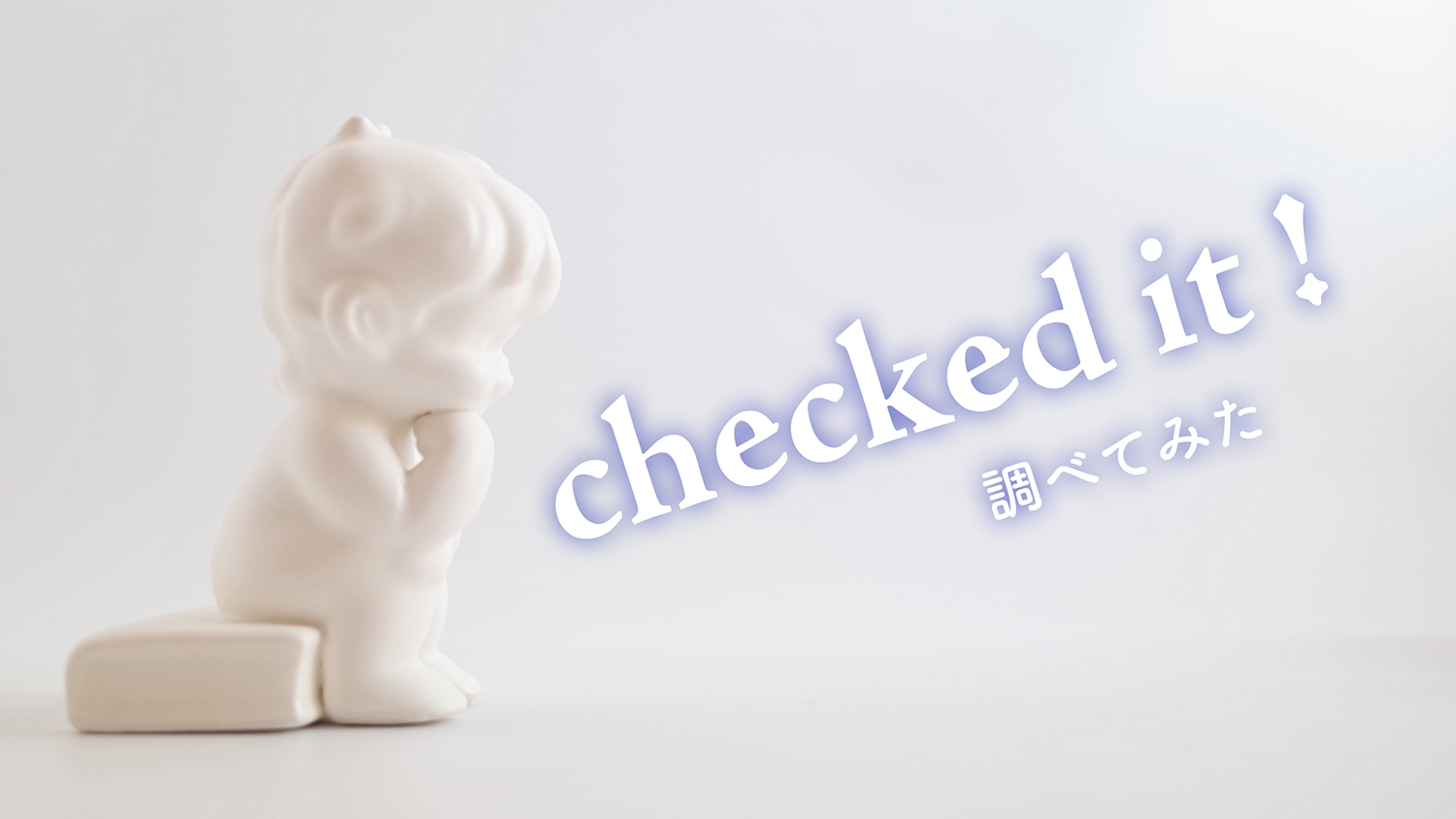
あちこち調べて、ちゃんとしたフェイスブックのカバー用の写真を用意したはずなのに…
ブラウザとアプリで表示がちがっていて、思うように表示できなくて悩んでいますね?
それ、Facebook公式ヘルプセンターの説明が間違っているんです!
この記事では一番ラクに設置できるサイズを、検証結果とともに、お伝えします。
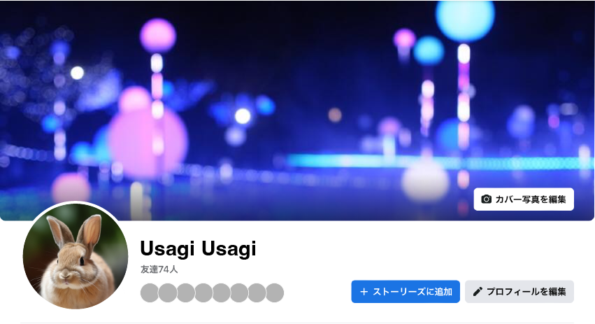
正しいサイズは「幅851ピクセルx高さ315ピクセル」!
フェイスブックのヘルプセンターでは、このように記載されています。
ページのカバー写真:
https://www.facebook.com/help/125379114252045
左揃えで画面いっぱいに表示されます。アスペクト比は16:9です。
元のサイズは少なくとも幅400ピクセルx高さ150ピクセルである必要があります。
幅851ピクセルx高さ315ピクセルで、100キロバイト未満のsRGB JPGファイルだと読み込み時間が短くなります。
ロゴやテキストを含むプロフィール写真やカバー写真には、PNGファイルを使用すると、より良い結果を得ることができます。
カバー写真の左側は部分的にプロフィール写真に隠される形になります。また、画面にフィットするようにトリミングやリサイズされる場合があります。
これを読む限り、とにかく16:9の割合で作ればいいんだな、と思います。
でも…、読み込み時間の短くなる推奨サイズ「幅851ピクセルx高さ315ピクセル」は、そもそも16:9になってないことに、お気づきでしょうか?
実際の画像で見比べてみましょう。
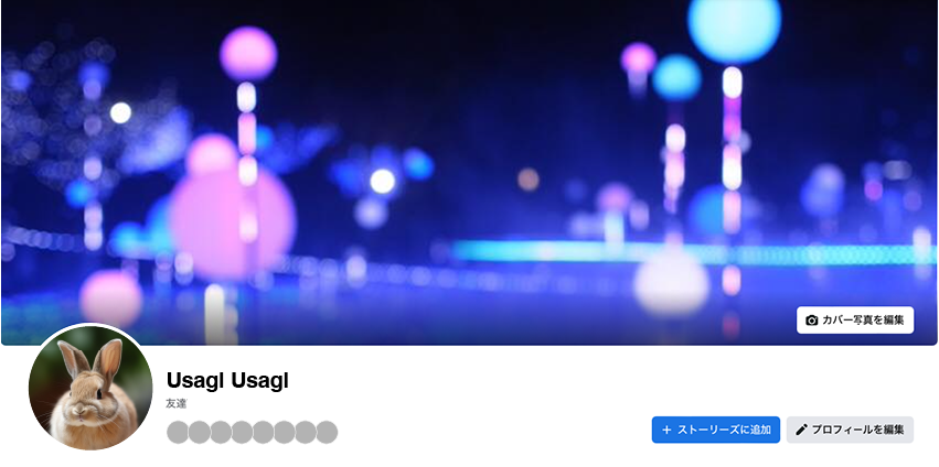
16:9で作成した画像がこちら。

横幅を推奨サイズの851ピクセルにすると、高さは478ピクセルになります。
幅851ピクセルx高さ315ピクセル で作成した画像がこちら。
異なる高さが一目瞭然ですね。
計算してみると、1:2.587…くらいのアスペクト比です。
この比率で制作すると、アプリで見てもブラウザで見ても、少なくとも天地(上下)を切らずに表示させることができます。
実際の実験結果をご覧ください。
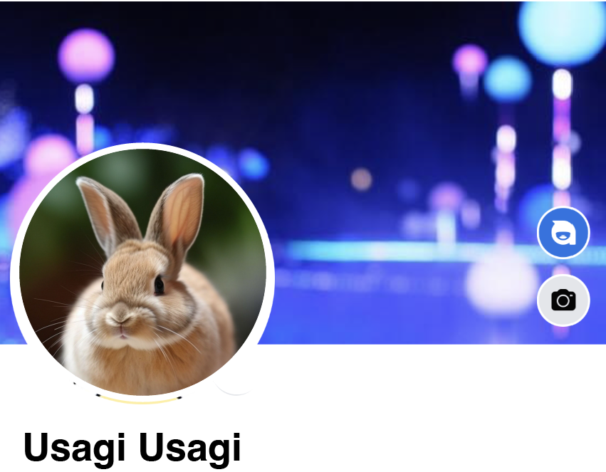
Facebookのトップ画像の一覧ー16:9画像ー
使っている背景画像は、縦横の比率が16:9の画像です。
 550600
Apple製品のみのサンプルでごめんなさい。
Facebookアプリ比較
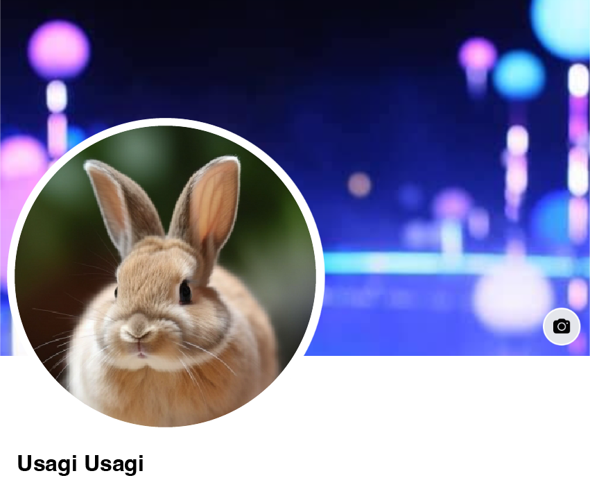
iPhone版
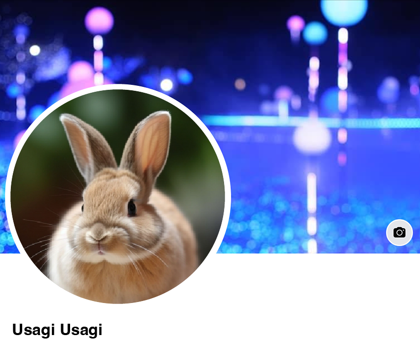
アイフォンアプリでは、16:9がピッタリハマります。
(写真の位置をずらすことができません)
16:9の写真が欠けることなくきれいに表示されるのは、iPhoneアプリだけです。
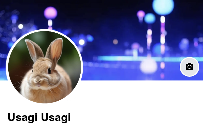
iPad版
iPhoneアプリに比べると左側が多めに切れています。
550600ヘルプセンターでは「左揃えで」とあるのにねぇ。
ブラウザ比較(Safariで検証)
元画像の左右が固定された状態で、天地の位置がずれてきます。
550600左右は元画像のままってことです。
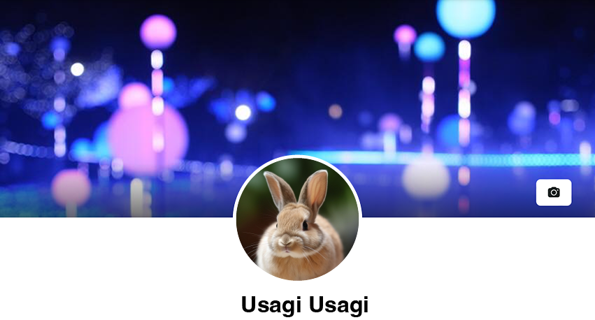
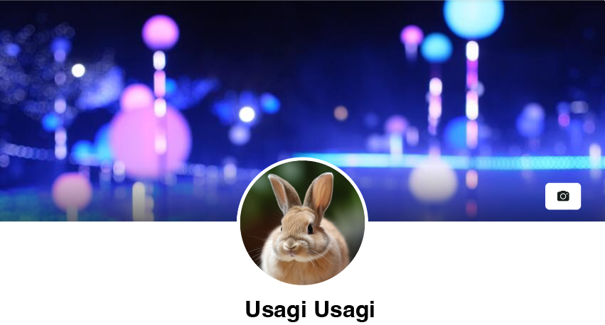
iPhone版

枠の中央と写真の中央を合わせて表示(天地中央揃え)。上下がカットされています。
iPad版(たて長に持って見た時)
枠の上部と写真の上部を合わせて表示され、下がカットされています。
550600なんでこれだけ、プロフィール写真をセンターに持ってきちゃったんでしょうか?
iPad版(よこ長に持って見た時)
枠の上部と写真の上部を合わせて表示され、下がカットされています。たて長に持って見た時と同じように見えます。
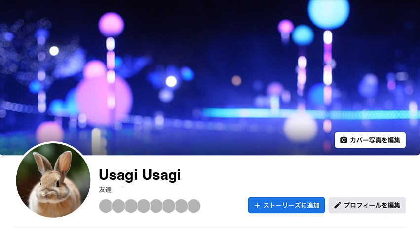
Mac(パソコン)版
枠の中央と写真の中央を合わせて表示(天地中央揃え)。上下がカットされています。iPhone版よりもほんの少し上にあがって表示されています。
Facebookのトップ画像の一覧ー幅851ピクセルx高さ315ピクセル画像ー
使っている画像は、ヘルプセンターに書かれている、幅851ピクセルx高さ315ピクセルで作った画像です。
すべての写真で、上下が切れていないのがわかります。
違っているのは、左右の表示される範囲だけです。
Facebookアプリ比較
iPhone版
iPad版
アイフォンアプリよりも、左右がちょっと切れています。
ブラウザ比較(Safariで検証)
iPhone版
iPhone版のサファリだけ、左右のカットされる分量が多いようです。
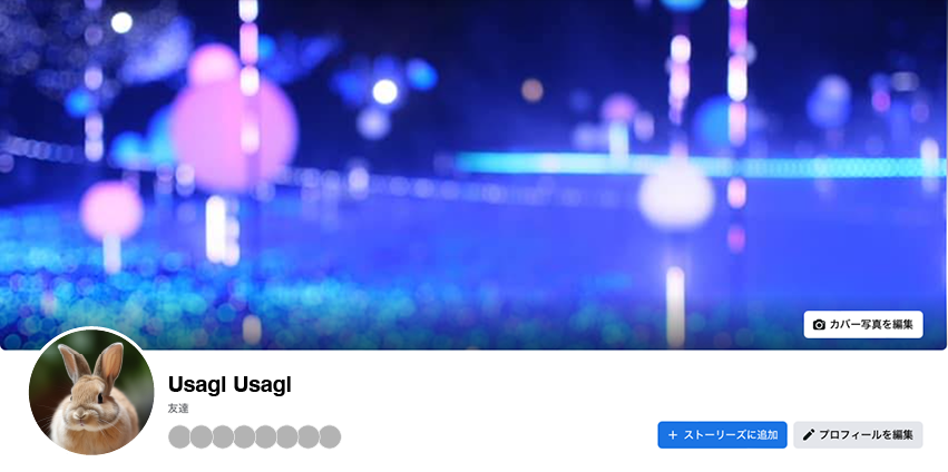
iPad版(たて長に持って見た時)
iPad版(よこ長に持って見た時)
Mac(パソコン)版
iPad版とパソコン版に、大きな違いはありません。元画像がそのまま表示されています。
Facebookアプリでは、左右に位置を調整できる
幅851ピクセルx高さ315ピクセルで作られた画像は、ピッタリサイズの16:9画像よりも横幅が長いので、アプリでカバーは設置する時に、左右の位置自分で決めることができます。
顔写真で半分くらい見えなくなってしまうので、中央を少しずらした方が、バランスが整います。
アプリ版で位置をずらしても、ブラウザ版での位置はずれません。元画像がそのまま表示されます。
まとめ
フェイスブックのトップ画像に文字を入れたい人にはとくにおすすめの回避方法です。
ぜひお試しください。
WindowsのブラウザやAndroid端末での見え方を検証できていないので、そちらでずれてしまっていたら、ごめんなさい。